This year's Congressional Baseball Game—the 84th iteration of the renowned partisan pastime—is less than a month away (specifically, on June 14—buy a ticket, it's for a good cause!), so it's time to update my database of statistics for the annual charity game. Yes, that's right—I'm so obsessed with numbers that I have some that show how good or bad members of Congress are at baseball.
This Google spreadsheet is based on the leaderboards page over at FanGraphs. It has not only the "Standard" stats like hits and RBI, but also FanGraphs's "Advanced" and "Value" stats, calculated the exact same way the sabermetric site defines them. If you want to know Tim Ryan's wRC+ or Rand Paul's WAR, this is the place to go. The spreadsheet goes back through the 2009 Congressional Baseball Game, thanks to box scores generously provided to me by the game's official scorers. It's not comprehensive—for instance, there are no batted-ball stats, and fielding is too hard to measure in a game whose defensive alignments change more often than the softball match at your latest family reunion—but it's enough to show us who's just playing for fun and who the truly feared players should be on June 14.
The highlights: Cedric Richmond, Congress's Shohei Ohtani, is now up to 2.3 WAR, eight times higher than anyone else's total. Seven of the game's nine best players by WAR are Democrats. And you'll notice a lot of lineup fixtures are leaving Congress after this year: the Democrats' Jared Polis, the Republicans' Jeff Flake, Tom Rooney, Ryan Costello, and Bill Shuster. (And Democrats' Joe Donnelly may very well lose his re-election bid.) By this time next year, the leaderboards could look very different: it's possible that John Shimkus, Chris Murphy, and Kevin Brady will be the only pre-2009 players left.
Showing posts with label Number-Crunching. Show all posts
Showing posts with label Number-Crunching. Show all posts
Sunday, May 20, 2018
Wednesday, February 21, 2018
My Model Nailed This Year's Hall of Famers—The Vote Totals, Not So Much
About one month ago, Chipper Jones, Vladimir Guerrero, Jim Thome, and Trevor Hoffman were elected to the Baseball Hall of Fame, which means two things: (1) this Hall of Fame election post mortem is almost one month overdue, and (2) for the first time in three years, my forecasting model correctly predicted the entire Hall of Fame class.
You'd think that would be cause for satisfaction (and I suppose it is better than nothing), but instead I'm pretty disappointed with its performance. The reason is that an election model doesn't really try to peg winners per se; rather, it tries to predict final vote totals—in other words, numbers. And quantitatively, my model had an off year, especially compared to some of my peers in the Hall of Fame forecasting world.
First, a brief rundown of my methodology. My Hall of Fame projections are based on the public ballots dutifully collected and shared with the world by Ryan Thibodaux (and, this year, his team of interns); I extend my gratitude to them again for sacrificing so much of their time doing so. Based on the percentage of public ballots each player is on to date, I calculate his estimated percentage of private (i.e., as yet unshared) votes based on how much those two numbers have differed in past Hall of Fame elections. These "Adjustment Factors"—positive for old-school candidates like Omar Vizquel, negative for steroid users or sabermetric darlings like Roger Clemens—are the demographic weighting to Ryan's raw polling data. And indeed, they produce more accurate results than just taking the Thibodaux Tracker as gospel:

My model's average error was 1.6 percentage points; the raw data was off by an average of three points per player. I didn't have as many big misses this year as last year; my worst performance was on Larry Walker, whom I overestimated by 5.0 points. My model assumed the erstwhile Rockie would gain votes in private balloting, as he had done every year from 2011 to 2016, but 2017 turned out to be the beginning of a trend; Walker did 10.5 points worse on 2018 private ballots than on public ones. I also missed Thome's final vote total by 3.5 points, although I feel better about that one, since first-year candidates are always tricky to predict. Most of my other predictions were pretty close to the mark, including eight players I predicted within a single percentage point. I came within two points of the correct answer for 17 of the 23 players forecasted, giving me a solid median error of 1.3 points. For stat nerds, I also had a root mean square error (RMSE) of 1.9 points.
All three error values (mean, median, and RMS) were the second-best of my now-six-year Hall of Fame forecasting career. But that's misleading: during the past two years, thanks to Ryan's tireless efforts, more votes have been made public in advance of the announcement than ever before. Of course my predictions are better now—there's less I don't know.
Really what we should be measuring is my accuracy at predicting only the 175 ballots that were still private when I issued my final projections just minutes before Jeff Idelson opened the envelope to announce the election winners. Here are the differences between my estimates for those ballots and what they actually ended up saying.

The biggest misses are still with the same players, but the true degree of my error is now made plain. I overshot Walker's private ballots by more than 12 percentage points, and Thome's by more than eight. Those aren't good performances no matter how you slice them. If we're focusing on the positives, I was within four percentage points on 16 of 23 players. My average error was 3.8 points, much better than last year when I had several double-digit misses, but my median error was 3.2 points, not as good as last year.
But where I really fell short was in comparison to other Hall of Fame forecasters: Chris Bodig, who published his first-ever projections this year on his website, Cooperstown Cred; Ross Carey, who hosts the Replacement Level Podcast and is the only one with mostly qualitative predictions; Scott Lindholm, who has been issuing his projections alongside me since day one; and Jason Sardell, who first issued his probabilistic forecast last year. Of them all, it was the rookie who performed the best: Bodig's private-ballot projections had a mean and median error of only 2.2 percentage points. His RMSE also ranked first (2.7 points), followed by Sardell (3.1), Carey (3.9), me (4.6), and Lindholm (6.3). Bodig also came the closest on the most players (10).

Overall, my model performed slightly better this year than it did last year, but that's cold comfort: everyone else improved over last year as well (anecdotally, this year's election felt more predictable than last), so I repeated my standing toward the bottom of the pack. Put simply, that's not good enough. After two years of subpar performances, any good scientist would reevaluate his or her methods, so that's what I'm going to do. Next winter, I'll explore some possible changes to the model in order to make it more accurate. Hopefully, it just needs a small tweak, like calculating Adjustment Factors based on the last two elections rather than the last three (or weighting more recent elections more heavily, a suggestion I've received on Twitter). However, I'm willing to entertain bigger changes too, such as calculating more candidates' vote totals the way I do for first-time candidates, or going more granular to look at exactly which voters are still private and extrapolating from their past votes. Anything in the service of more accuracy!
You'd think that would be cause for satisfaction (and I suppose it is better than nothing), but instead I'm pretty disappointed with its performance. The reason is that an election model doesn't really try to peg winners per se; rather, it tries to predict final vote totals—in other words, numbers. And quantitatively, my model had an off year, especially compared to some of my peers in the Hall of Fame forecasting world.
First, a brief rundown of my methodology. My Hall of Fame projections are based on the public ballots dutifully collected and shared with the world by Ryan Thibodaux (and, this year, his team of interns); I extend my gratitude to them again for sacrificing so much of their time doing so. Based on the percentage of public ballots each player is on to date, I calculate his estimated percentage of private (i.e., as yet unshared) votes based on how much those two numbers have differed in past Hall of Fame elections. These "Adjustment Factors"—positive for old-school candidates like Omar Vizquel, negative for steroid users or sabermetric darlings like Roger Clemens—are the demographic weighting to Ryan's raw polling data. And indeed, they produce more accurate results than just taking the Thibodaux Tracker as gospel:
My model's average error was 1.6 percentage points; the raw data was off by an average of three points per player. I didn't have as many big misses this year as last year; my worst performance was on Larry Walker, whom I overestimated by 5.0 points. My model assumed the erstwhile Rockie would gain votes in private balloting, as he had done every year from 2011 to 2016, but 2017 turned out to be the beginning of a trend; Walker did 10.5 points worse on 2018 private ballots than on public ones. I also missed Thome's final vote total by 3.5 points, although I feel better about that one, since first-year candidates are always tricky to predict. Most of my other predictions were pretty close to the mark, including eight players I predicted within a single percentage point. I came within two points of the correct answer for 17 of the 23 players forecasted, giving me a solid median error of 1.3 points. For stat nerds, I also had a root mean square error (RMSE) of 1.9 points.
All three error values (mean, median, and RMS) were the second-best of my now-six-year Hall of Fame forecasting career. But that's misleading: during the past two years, thanks to Ryan's tireless efforts, more votes have been made public in advance of the announcement than ever before. Of course my predictions are better now—there's less I don't know.
Really what we should be measuring is my accuracy at predicting only the 175 ballots that were still private when I issued my final projections just minutes before Jeff Idelson opened the envelope to announce the election winners. Here are the differences between my estimates for those ballots and what they actually ended up saying.
The biggest misses are still with the same players, but the true degree of my error is now made plain. I overshot Walker's private ballots by more than 12 percentage points, and Thome's by more than eight. Those aren't good performances no matter how you slice them. If we're focusing on the positives, I was within four percentage points on 16 of 23 players. My average error was 3.8 points, much better than last year when I had several double-digit misses, but my median error was 3.2 points, not as good as last year.
But where I really fell short was in comparison to other Hall of Fame forecasters: Chris Bodig, who published his first-ever projections this year on his website, Cooperstown Cred; Ross Carey, who hosts the Replacement Level Podcast and is the only one with mostly qualitative predictions; Scott Lindholm, who has been issuing his projections alongside me since day one; and Jason Sardell, who first issued his probabilistic forecast last year. Of them all, it was the rookie who performed the best: Bodig's private-ballot projections had a mean and median error of only 2.2 percentage points. His RMSE also ranked first (2.7 points), followed by Sardell (3.1), Carey (3.9), me (4.6), and Lindholm (6.3). Bodig also came the closest on the most players (10).
Overall, my model performed slightly better this year than it did last year, but that's cold comfort: everyone else improved over last year as well (anecdotally, this year's election felt more predictable than last), so I repeated my standing toward the bottom of the pack. Put simply, that's not good enough. After two years of subpar performances, any good scientist would reevaluate his or her methods, so that's what I'm going to do. Next winter, I'll explore some possible changes to the model in order to make it more accurate. Hopefully, it just needs a small tweak, like calculating Adjustment Factors based on the last two elections rather than the last three (or weighting more recent elections more heavily, a suggestion I've received on Twitter). However, I'm willing to entertain bigger changes too, such as calculating more candidates' vote totals the way I do for first-time candidates, or going more granular to look at exactly which voters are still private and extrapolating from their past votes. Anything in the service of more accuracy!
Tuesday, January 23, 2018
Edgar Martínez Is a Coin Flip Away from the Hall of Fame
In early December, I thought we were finally going to get a break. After four consecutive Hall of Fame elections where the outcome was in real doubt, this year looked like a gimme: Chipper Jones, Jim Thome, Vladimir Guerrero, and Trevor Hoffman were going to make the Hall of Fame comfortably; no one else would sniff 75%.
Then Edgar Martínez started polling at 80%. And stayed there. And stayed there. And stayed there.
Thanks to Edgar's steady strength in Ryan Thibodaux's BBHOF Tracker, which aggregates all Hall of Fame ballots made public so far this year, my projection model of the Baseball Hall of Fame election has alternated between forecasting the Mariner great's narrow election and predicting he would barely fall short. Despite the roller coaster of emotion these fluctuations have caused on Twitter, the reality is that my model paints a consistent picture: Martínez's odds are basically 50-50.
My model, which is in its sixth year of predicting the Hall of Fame election, operates on the premise that publicly released ballots differ materially—and consistently—from ballots whose casters choose to keep them private. BBWAA members who share their ballots on Twitter tend to be more willing to vote for PED users, assess candidates using advanced metrics, and use up all 10 spots on their ballot. Private voters—often more grizzled writers who in many cases have stopped covering baseball altogether—prefer "gritty" candidates whose cases rely on traditional metrics like hits, wins, or Gold Glove Awards. As a result, candidates like Barry Bonds, Roger Clemens (PEDs), Mike Mussina (requires advanced stats to appreciate), and Martínez (spent most of his career at DH, a position many baseball purists still pooh-pooh) do substantially worse on private ballots than on public ballots. Candidates like Hoffman (so many saves) and Omar Vizquel (so many Gold Gloves) can be expected to do better on ballots we haven't seen than on the ones we have.
That means the numbers in Thibodaux's Tracker—a.k.a. the public ballots—should be taken seriously but not literally. What my model does is quantify the amount by which each player's vote total in the Tracker should be adjusted. Specifically, I look at the percentage-point difference between each player's performance on public vs. private ballots in the last three Hall of Fame elections (2017, 2016, and 2015). The average of these three numbers (or just two if the player has been on the ballot only since 2016, or just one if he debuted on the ballot last year) is what I call the player's Adjustment Factor. My model simply assumes that the player's public-to-private shift this year will match that average.
Let's take Edgar as an example. In 2017, his private-ballot performance was 16.6 percentage points lower than his public-ballot performance. In 2016, it was 7.7 percentage points lower, and in 2015 it was 6.8 percentage points lower. That averages out to an Adjustment Factor of −10.37 percentage points. As of Monday night, Martínez was polling at 79.23% in the Tracker, so his estimated performance on private ballots is 68.86%.
The final step in my model is to combine the public-ballot performance with the estimated private-ballot performance in the appropriate proportions. In the same example, as of Monday night, 207 of an expected 424 ballots had been made public, or 48.82%. If 48.82% of ballots vote for Martínez at a rate of 79.23%, and the remaining 51.18% vote for Martínez at a rate of 68.86%, that computes to an overall performance of 73.92%—just over one point shy of induction.
But my model is far from infallible. Last year, my private-ballot projections were off by an average of 4.8 percentage points—a decidedly meh performance in the small community of Hall of Fame projection models. (But don't stop reading—historically, my projections have fared much better.) Small, subjective methodological decisions can be enough to affect outcomes in what is truly a mathematical game of inches. For example, why take a straight average of Edgar's last three public-private differentials when they have been growing more and more gaping over time? (Answer: in past years, with other candidates, a straight average has proven more accurate than one that weights recent years more heavily. Historically speaking, Edgar is equally likely to revert to his "usual" modest Adjustment Factor as he is to continue trending in a bad direction.) If there's one thing that studying Hall of Fame elections has taught me, it's that voters will zig when you expect them to zag.
One of my fellow Hall of Fame forecasters, Jason Sardell, wisely communicates the uncertainty inherent in our vocation by providing not only projected vote totals, but also the probability that each candidate will be elected. His model, which uses a totally different methodology based on voter adds and drops, gives Edgar just a 12% chance of induction as of Monday night. I'm not smart enough to assign probabilities to my own model, but as discussed above, it's pretty clear from the way Edgar has seesawed around the required 75% that his shot is no better than a coin flip. Therefore, when the election results are announced this Wednesday at 6pm ET, no matter where Martínez will fall on my model, no outcome should be a surprise.
Below are my current Hall of Fame projections for every candidate on the ballot. They will be updated in real time leading up to the announcement. (UPDATE, January 24: The below are my final projections issued just before the announcement.)
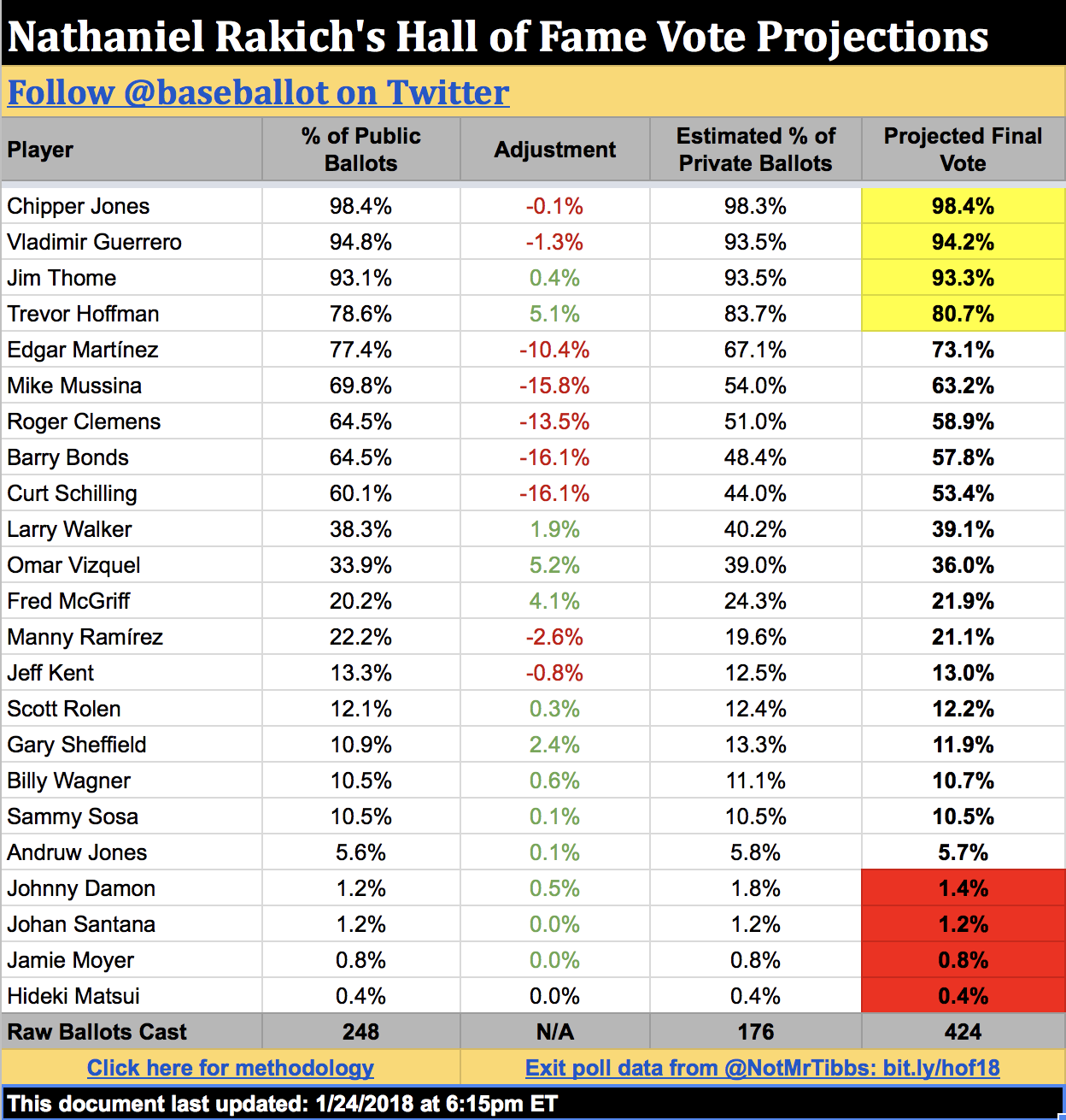
(Still with me? Huzzah. There's one loose methodological end I'd like to tie up for those of you who are interested: how I calculate the vote shares of first-time candidates. This year, that's Chipper Jones, Thome, Vizquel, Scott Rolen, Andruw Jones, Johnny Damon, and Johan Santana.
Without previous vote history to go off, my model does the next best thing for these players: it looks at which other candidate on the ballot correlates most strongly with—or against—them. If New Candidate X shares many of the same public voters with Old Candidate Y, then we can be fairly sure that the two will also drop or rise in tandem among private ballots. For example, Vizquel's support correlates most strongly with opposition to Bonds: as of Monday night, just 21% of known Bonds voters had voted for Vizquel, but 49% of non-Bonds voters had. Holding those numbers steady, I use my model's final prediction of the number of Bonds voters to figure out Vizquel's final percentage as well.
Here are the other ballot rookies' closest matches:
Finally, anyone with one or zero public votes is judged to be a non-serious candidate. Every year, one or two writers casts a misguided ballot for a Tim Wakefield or a Garret Anderson. There's little use in trying to predict these truly random events, so all of these players—including Jamie Moyer this year—have an Adjustment Factor of zero.)
Then Edgar Martínez started polling at 80%. And stayed there. And stayed there. And stayed there.
Thanks to Edgar's steady strength in Ryan Thibodaux's BBHOF Tracker, which aggregates all Hall of Fame ballots made public so far this year, my projection model of the Baseball Hall of Fame election has alternated between forecasting the Mariner great's narrow election and predicting he would barely fall short. Despite the roller coaster of emotion these fluctuations have caused on Twitter, the reality is that my model paints a consistent picture: Martínez's odds are basically 50-50.
My model, which is in its sixth year of predicting the Hall of Fame election, operates on the premise that publicly released ballots differ materially—and consistently—from ballots whose casters choose to keep them private. BBWAA members who share their ballots on Twitter tend to be more willing to vote for PED users, assess candidates using advanced metrics, and use up all 10 spots on their ballot. Private voters—often more grizzled writers who in many cases have stopped covering baseball altogether—prefer "gritty" candidates whose cases rely on traditional metrics like hits, wins, or Gold Glove Awards. As a result, candidates like Barry Bonds, Roger Clemens (PEDs), Mike Mussina (requires advanced stats to appreciate), and Martínez (spent most of his career at DH, a position many baseball purists still pooh-pooh) do substantially worse on private ballots than on public ballots. Candidates like Hoffman (so many saves) and Omar Vizquel (so many Gold Gloves) can be expected to do better on ballots we haven't seen than on the ones we have.
That means the numbers in Thibodaux's Tracker—a.k.a. the public ballots—should be taken seriously but not literally. What my model does is quantify the amount by which each player's vote total in the Tracker should be adjusted. Specifically, I look at the percentage-point difference between each player's performance on public vs. private ballots in the last three Hall of Fame elections (2017, 2016, and 2015). The average of these three numbers (or just two if the player has been on the ballot only since 2016, or just one if he debuted on the ballot last year) is what I call the player's Adjustment Factor. My model simply assumes that the player's public-to-private shift this year will match that average.
Let's take Edgar as an example. In 2017, his private-ballot performance was 16.6 percentage points lower than his public-ballot performance. In 2016, it was 7.7 percentage points lower, and in 2015 it was 6.8 percentage points lower. That averages out to an Adjustment Factor of −10.37 percentage points. As of Monday night, Martínez was polling at 79.23% in the Tracker, so his estimated performance on private ballots is 68.86%.
The final step in my model is to combine the public-ballot performance with the estimated private-ballot performance in the appropriate proportions. In the same example, as of Monday night, 207 of an expected 424 ballots had been made public, or 48.82%. If 48.82% of ballots vote for Martínez at a rate of 79.23%, and the remaining 51.18% vote for Martínez at a rate of 68.86%, that computes to an overall performance of 73.92%—just over one point shy of induction.
But my model is far from infallible. Last year, my private-ballot projections were off by an average of 4.8 percentage points—a decidedly meh performance in the small community of Hall of Fame projection models. (But don't stop reading—historically, my projections have fared much better.) Small, subjective methodological decisions can be enough to affect outcomes in what is truly a mathematical game of inches. For example, why take a straight average of Edgar's last three public-private differentials when they have been growing more and more gaping over time? (Answer: in past years, with other candidates, a straight average has proven more accurate than one that weights recent years more heavily. Historically speaking, Edgar is equally likely to revert to his "usual" modest Adjustment Factor as he is to continue trending in a bad direction.) If there's one thing that studying Hall of Fame elections has taught me, it's that voters will zig when you expect them to zag.
One of my fellow Hall of Fame forecasters, Jason Sardell, wisely communicates the uncertainty inherent in our vocation by providing not only projected vote totals, but also the probability that each candidate will be elected. His model, which uses a totally different methodology based on voter adds and drops, gives Edgar just a 12% chance of induction as of Monday night. I'm not smart enough to assign probabilities to my own model, but as discussed above, it's pretty clear from the way Edgar has seesawed around the required 75% that his shot is no better than a coin flip. Therefore, when the election results are announced this Wednesday at 6pm ET, no matter where Martínez will fall on my model, no outcome should be a surprise.
Below are my current Hall of Fame projections for every candidate on the ballot. They will be updated in real time leading up to the announcement. (UPDATE, January 24: The below are my final projections issued just before the announcement.)
(Still with me? Huzzah. There's one loose methodological end I'd like to tie up for those of you who are interested: how I calculate the vote shares of first-time candidates. This year, that's Chipper Jones, Thome, Vizquel, Scott Rolen, Andruw Jones, Johnny Damon, and Johan Santana.
Without previous vote history to go off, my model does the next best thing for these players: it looks at which other candidate on the ballot correlates most strongly with—or against—them. If New Candidate X shares many of the same public voters with Old Candidate Y, then we can be fairly sure that the two will also drop or rise in tandem among private ballots. For example, Vizquel's support correlates most strongly with opposition to Bonds: as of Monday night, just 21% of known Bonds voters had voted for Vizquel, but 49% of non-Bonds voters had. Holding those numbers steady, I use my model's final prediction of the number of Bonds voters to figure out Vizquel's final percentage as well.
Here are the other ballot rookies' closest matches:
- Chipper voters correlate best with Bonds voters, though not super strongly, with the result that Chipper is expected to lose a little bit of ground on private ballots.
- Thome voters have a strong negative correlation with Manny Ramírez voters, so Thome is expected to gain ground in private balloting.
- Rolen voters correlate well with Larry Walker voters, giving Rolen a slight boost among private voters.
- Andruw voters are negatively correlated with Jeff Kent voters; in fact, no one has voted for both men. This gives Andruw a tiny bump in private balloting.
- It's a very small sample, but public Damon voters and public Bonds voters have zero overlap. Damon gets a decent-sized private-ballot bonus because of that.
- Santana voters are also inclined to vote for Gary Sheffield at high rates, although small-sample caveats apply. Therefore, Santana gets a slight boost in the private projections.
Finally, anyone with one or zero public votes is judged to be a non-serious candidate. Every year, one or two writers casts a misguided ballot for a Tim Wakefield or a Garret Anderson. There's little use in trying to predict these truly random events, so all of these players—including Jamie Moyer this year—have an Adjustment Factor of zero.)
Monday, July 17, 2017
How Many Fans Does Each MLB Team Have?: The 2017 Baseball Census
For the second straight year, Harris failed to release its formerly annual baseball poll. Usually conducted right around the All-Star break, the survey is valuable as pretty much our only direct measure of which MLB team is most popular nationwide. But now that I fear the Harris baseball poll has met its permanent demise, anyone interested in the demographics of baseball fans has to take matters into his or her own hands.
That's what I've done for the last three years here at Baseballot. Harris may be the only pollster that canvasses the whole nation about all 30 teams, but our friends over at Public Policy Polling (PPP) love to throw a baseball question or two into their state-by-state political polls. For each state that PPP polls, I use the latest population estimates from the U.S. Census Bureau to estimate a raw number of fans for each team in that state. Here are the cumulative figures nationwide for July 2017:
*These numbers do not include fans in Canada, meaning the Blue Jays are surely underrepresented.
Unfortunately, we haven't gotten a lot of new baseball polls in the past 12 months; PPP was busy asking poll questions about something else, I guess. We did get a new poll of Florida, which is as much a baseball bellwether as it is a political one. In last September's poll, the Yankees reclaimed the title of Florida's favorite baseball team, just as they are America's favorite team with an estimated 25,226,872 fans nationwide. New York (AL) leapfrogged ahead of the Marlins and Rays in the Sunshine State, the two teams fighting for the dubious honor of least popular in the United States. (The numbers above don't include Washington, DC, either, so the Nationals are undercounted just like the Blue Jays.)
We also learned about the baseball preferences of Utah for the first time (finding: they don't really care too much), bringing the coverage of our makeshift baseball census to 39 of the 50 states (representing 88.5% of the U.S. population). Here's what's still missing:

Obviously, then, there are some limitations to this exercise. Missing states like Indiana and Alabama means our numbers for teams like the Cubs/White Sox and Braves are lower than they truly are. And PPP's baseball questions are worded in an opt-out manner, so 78% of poll respondents nationwide claimed to have a favorite team even though we know that only around 40–50% of Americans are baseball fans. On the other hand, PPP also only has time to ask about eight or so MLB teams per state, meaning the handful of fans of the other ~22 teams in that state don't get counted. So, yes, this census is hardly scientific, but it's a fun rough approximation of some very interesting data.
That's what I've done for the last three years here at Baseballot. Harris may be the only pollster that canvasses the whole nation about all 30 teams, but our friends over at Public Policy Polling (PPP) love to throw a baseball question or two into their state-by-state political polls. For each state that PPP polls, I use the latest population estimates from the U.S. Census Bureau to estimate a raw number of fans for each team in that state. Here are the cumulative figures nationwide for July 2017:
| Team | Fans | Team | Fans |
|---|---|---|---|
| New York Yankees | 25,226,872 | Colorado Rockies | 5,017,208 |
| Boston Red Sox | 20,193,922 | Kansas City Royals | 4,830,504 |
| Atlanta Braves | 20,085,743 | Baltimore Orioles | 4,612,809 |
| Chicago Cubs | 18,407,160 | Minnesota Twins | 4,541,341 |
| San Francisco Giants | 11,353,160 | Cleveland Indians | 4,331,383 |
| Texas Rangers | 10,414,884 | Arizona Diamondbacks | 4,207,748 |
| St. Louis Cardinals | 8,743,144 | Pittsburgh Pirates | 4,161,965 |
| Los Angeles Dodgers | 8,380,484 | Milwaukee Brewers | 3,975,281 |
| Detroit Tigers | 7,594,395 | Oakland Athletics | 3,842,463 |
| New York Mets | 7,035,826 | San Diego Padres | 3,371,712 |
| Houston Astros | 6,734,407 | Chicago White Sox | 3,023,366 |
| Los Angeles Angels | 6,702,815 | Tampa Bay Rays | 3,017,097 |
| Seattle Mariners | 6,023,758 | Miami Marlins | 2,979,375 |
| Philadelphia Phillies | 5,402,108 | Washington Nationals | 2,812,690 |
| Cincinnati Reds | 5,107,524 | Toronto Blue Jays* | 210,801 |
*These numbers do not include fans in Canada, meaning the Blue Jays are surely underrepresented.
Unfortunately, we haven't gotten a lot of new baseball polls in the past 12 months; PPP was busy asking poll questions about something else, I guess. We did get a new poll of Florida, which is as much a baseball bellwether as it is a political one. In last September's poll, the Yankees reclaimed the title of Florida's favorite baseball team, just as they are America's favorite team with an estimated 25,226,872 fans nationwide. New York (AL) leapfrogged ahead of the Marlins and Rays in the Sunshine State, the two teams fighting for the dubious honor of least popular in the United States. (The numbers above don't include Washington, DC, either, so the Nationals are undercounted just like the Blue Jays.)
We also learned about the baseball preferences of Utah for the first time (finding: they don't really care too much), bringing the coverage of our makeshift baseball census to 39 of the 50 states (representing 88.5% of the U.S. population). Here's what's still missing:
Obviously, then, there are some limitations to this exercise. Missing states like Indiana and Alabama means our numbers for teams like the Cubs/White Sox and Braves are lower than they truly are. And PPP's baseball questions are worded in an opt-out manner, so 78% of poll respondents nationwide claimed to have a favorite team even though we know that only around 40–50% of Americans are baseball fans. On the other hand, PPP also only has time to ask about eight or so MLB teams per state, meaning the handful of fans of the other ~22 teams in that state don't get counted. So, yes, this census is hardly scientific, but it's a fun rough approximation of some very interesting data.
Sunday, February 19, 2017
The Oscars Really Do Spread the Wealth Around
If it's February, it's time to indulge in hobby-making over a different kind of election here at Baseballot: the Academy Awards. Notoriously difficult to predict due to a lack of hard data and polling, the Oscars often force prognosticators to resort to fickle historical precedents, working theories, and, worst of all, gut instinct.
One of those working theories is that the Academy of Motion Picture Arts and Sciences likes to "spread the wealth around." The idea is that the Academy has many favorite people and movies that it would like to honor, but it only has a limited number of awards to bestow, so it tries to sprinkle them around strategically so that everyone deserving gets a prize for something. At first, it seems a stretch of the imagination to think that a disparate voting bloc could be so coordinated and strategic in its thinking. Academy members aren't making decisions as a unit; their results are an aggregation of thousands of individual opinions. However, the Academy is still a smaller and more homogenous electorate than most, and their preferences may reflect the groupthink of the Hollywood insiders who dominate their ranks. Sure enough, a dive into the data shows that the Academy may indeed lean toward distributing the wealth evenly.
One of this year's hottest Oscar races is that for Best Actor. Will Casey Affleck join the club of Oscar winners for his portrayal of a Boston janitor in Manchester by the Sea, or will Denzel Washington take home his third trophy for hamming it up in Fences? If you believe that the Oscars spread the wealth around, you'd probably lean toward Affleck—and history suggests that's a good bet. At the last 15 ceremonies, a past Oscar winner has gone up against an Oscar virgin 47 times in one of the four acting categories (Best Actor, Best Actress, Best Supporting Actor, and Best Supporting Actress). A full 32% of nominees in those 47 races were past winners, so, all things being equal, past winners should have won at around an equal rate. However, all things clearly were not equal, as those past winners prevailed just seven times out of 47: 15%. Looking at the same data another way, they won just seven times out of their 75 nominations—a 9% success rate. That's far lower than a nominee's default chances in a five-person category: one out of five, or 20%.
Some caution is still warranted, though. Oscar history is littered with famous counterexamples: the time two-time winner Meryl Streep (The Iron Lady) stole Best Actress from underneath the overdue Viola Davis's (The Help) nose at the 2011 ceremony, or when Sean Penn (Milk), a prior winner for Mystic River, edged out Mickey Rourke for The Wrestler at the 2008 awards. In addition, the converse of spreading the wealth isn't necessarily true. Even if the Oscars make a concerted effort to keep extra statuettes out of the hands of people who already have them, they probably don't bend over backward to reward undecorated artists who are "due."
Finally, there may be a difference in wealth-spreading between the acting categories, where the nominees and their records are well known, and the craft categories, where the awards are thought of as going to films, not people. This can explain the wide inequalities in categories like Best Sound Mixing. Sound mixer Scott Millan has won four Oscars in his nine nominations, and legendary sound engineer Fred Hynes won five times in seven tries. By contrast, Greg P. Russell, nominated this year for mixing 13 Hours, has compiled 17 nominations and has never won. And the all-time record for most Oscar nominations without a win goes to mixer Kevin O'Connell, who is a 21-time nominee, including his bid this year for Hacksaw Ridge. Unfortunately, both will almost certainly lose this year to La La Land mixer Andy Nelson, who has two wins in his previous 20 nominations. Even if this isn't because of the longstanding trophy inequality in Best Sound Mixing, it is certainly consistent with it.
Within each ceremony, the Academy also appears to spread the wealth fairly evenly among movies. Of the last 15 Oscars, seven can be considered "spread the wealth" ceremonies, while only three can really be considered "sweeps" (2013 for Gravity, 2008 for Slumdog Millionaire, and 2003 for The Lord of the Rings: The Return of the King); five are ambiguous. Granted, this is a subjective eyeballing of the data, but I have some hard numbers too. The median number of Oscars won by the winningest film of the night over the last 15 years is five—a respectable total, but not one that screams "unstoppable juggernaut." Twelve of the 15 ceremonies saw the winningest film take six Oscars or fewer. Eight of the 15 years were below the average mode of 5.4 Oscars, represented by the black line in the chart below:

More stats: during the same 15-year span, anywhere between nine and 14 feature films (i.e., not shorts) per year could go home and call themselves an Oscar winner—but 10 out of 15 of the years, that number was 12, 13, or 14 films. Just five times was it nine, 10, or 11 films. Finally, at nine of the 15 ceremonies, the standard deviation of the distribution of Oscars among feature films was less than the average standard deviation, again represented by the black line. (A low standard deviation means that the values in a dataset tend to cluster around the mean—so a year when four films each won three awards has a low standard deviation, but a year when one film won 11, two films won two, and the rest won one has a very high standard deviation.)

With only three ceremonies in the past 15 years boasting significantly above-average standard deviations, it's clear that a low standard deviation is the norm—which means it's typical for more films to get fewer Oscars. In other words, spreading the wealth.
Of course, the pattern is only true until it isn't. Every so often, a juggernaut of a movie does come along to sweep the Oscars: think Titanic, which went 11 for 14 at the 1997 ceremony. This year appears poised to deliver us another of these rare occurrences. La La Land reaped a record 14 nominations, and according to prediction site Gold Derby, it is favored to win 10 trophies next Sunday. Don't let overarching historical trends override year-specific considerations, like the runaway popularity of Damien Chazelle's musical, when making your Oscar picks.
One of those working theories is that the Academy of Motion Picture Arts and Sciences likes to "spread the wealth around." The idea is that the Academy has many favorite people and movies that it would like to honor, but it only has a limited number of awards to bestow, so it tries to sprinkle them around strategically so that everyone deserving gets a prize for something. At first, it seems a stretch of the imagination to think that a disparate voting bloc could be so coordinated and strategic in its thinking. Academy members aren't making decisions as a unit; their results are an aggregation of thousands of individual opinions. However, the Academy is still a smaller and more homogenous electorate than most, and their preferences may reflect the groupthink of the Hollywood insiders who dominate their ranks. Sure enough, a dive into the data shows that the Academy may indeed lean toward distributing the wealth evenly.
One of this year's hottest Oscar races is that for Best Actor. Will Casey Affleck join the club of Oscar winners for his portrayal of a Boston janitor in Manchester by the Sea, or will Denzel Washington take home his third trophy for hamming it up in Fences? If you believe that the Oscars spread the wealth around, you'd probably lean toward Affleck—and history suggests that's a good bet. At the last 15 ceremonies, a past Oscar winner has gone up against an Oscar virgin 47 times in one of the four acting categories (Best Actor, Best Actress, Best Supporting Actor, and Best Supporting Actress). A full 32% of nominees in those 47 races were past winners, so, all things being equal, past winners should have won at around an equal rate. However, all things clearly were not equal, as those past winners prevailed just seven times out of 47: 15%. Looking at the same data another way, they won just seven times out of their 75 nominations—a 9% success rate. That's far lower than a nominee's default chances in a five-person category: one out of five, or 20%.
Some caution is still warranted, though. Oscar history is littered with famous counterexamples: the time two-time winner Meryl Streep (The Iron Lady) stole Best Actress from underneath the overdue Viola Davis's (The Help) nose at the 2011 ceremony, or when Sean Penn (Milk), a prior winner for Mystic River, edged out Mickey Rourke for The Wrestler at the 2008 awards. In addition, the converse of spreading the wealth isn't necessarily true. Even if the Oscars make a concerted effort to keep extra statuettes out of the hands of people who already have them, they probably don't bend over backward to reward undecorated artists who are "due."
Finally, there may be a difference in wealth-spreading between the acting categories, where the nominees and their records are well known, and the craft categories, where the awards are thought of as going to films, not people. This can explain the wide inequalities in categories like Best Sound Mixing. Sound mixer Scott Millan has won four Oscars in his nine nominations, and legendary sound engineer Fred Hynes won five times in seven tries. By contrast, Greg P. Russell, nominated this year for mixing 13 Hours, has compiled 17 nominations and has never won. And the all-time record for most Oscar nominations without a win goes to mixer Kevin O'Connell, who is a 21-time nominee, including his bid this year for Hacksaw Ridge. Unfortunately, both will almost certainly lose this year to La La Land mixer Andy Nelson, who has two wins in his previous 20 nominations. Even if this isn't because of the longstanding trophy inequality in Best Sound Mixing, it is certainly consistent with it.
Within each ceremony, the Academy also appears to spread the wealth fairly evenly among movies. Of the last 15 Oscars, seven can be considered "spread the wealth" ceremonies, while only three can really be considered "sweeps" (2013 for Gravity, 2008 for Slumdog Millionaire, and 2003 for The Lord of the Rings: The Return of the King); five are ambiguous. Granted, this is a subjective eyeballing of the data, but I have some hard numbers too. The median number of Oscars won by the winningest film of the night over the last 15 years is five—a respectable total, but not one that screams "unstoppable juggernaut." Twelve of the 15 ceremonies saw the winningest film take six Oscars or fewer. Eight of the 15 years were below the average mode of 5.4 Oscars, represented by the black line in the chart below:
More stats: during the same 15-year span, anywhere between nine and 14 feature films (i.e., not shorts) per year could go home and call themselves an Oscar winner—but 10 out of 15 of the years, that number was 12, 13, or 14 films. Just five times was it nine, 10, or 11 films. Finally, at nine of the 15 ceremonies, the standard deviation of the distribution of Oscars among feature films was less than the average standard deviation, again represented by the black line. (A low standard deviation means that the values in a dataset tend to cluster around the mean—so a year when four films each won three awards has a low standard deviation, but a year when one film won 11, two films won two, and the rest won one has a very high standard deviation.)
With only three ceremonies in the past 15 years boasting significantly above-average standard deviations, it's clear that a low standard deviation is the norm—which means it's typical for more films to get fewer Oscars. In other words, spreading the wealth.
Of course, the pattern is only true until it isn't. Every so often, a juggernaut of a movie does come along to sweep the Oscars: think Titanic, which went 11 for 14 at the 1997 ceremony. This year appears poised to deliver us another of these rare occurrences. La La Land reaped a record 14 nominations, and according to prediction site Gold Derby, it is favored to win 10 trophies next Sunday. Don't let overarching historical trends override year-specific considerations, like the runaway popularity of Damien Chazelle's musical, when making your Oscar picks.
Wednesday, February 15, 2017
After Three Special Elections, What We Do and Don't Know About the 'Trump Effect'
Let's get one thing out of the way—we can't possibly know with any certainty what's going to happen in 2018. The elections are just too far away, too much can change, and right now we're operating with a very small sample of information.
With that said, three partisan special elections have taken place since the January 20 inauguration of President Donald Trump. These races are as hyperlocal as you can get, and they have not drawn much attention or voter interest. But these obscure elections have followed an interesting pattern with respect to Trump.
 *Virginia holds legislative elections in odd years, so these numbers are for elections in 2011, 2013, and 2015.
†The regularly scheduled election in Minnesota House District 32B was canceled in 2016 and rescheduled for the special election in February 2017.
Each of the districts shifted dramatically toward Democrats when you compare the results of the 2016 presidential election in the district to its special election results this year. Iowa's House District 89 went from 52–41 Clinton to 72–27 for the Democratic State House candidate. Minnesota's House District 32B went from 60–31 Trump to a narrow 53–47 Republican win. And Virginia's House District 71 went from 85–10 Clinton to 90–0 for the Democratic House of Delegates candidate, although it should probably be ignored because Republicans did not contest the special election. (Thanks to Daily Kos Elections for doing the invaluable work of calculating presidential results by legislative district.)
This could be evidence for the "Trump effect"—Trump's stormy tenure and record unpopularity already poisoning Republican electoral prospects as voters react to what they're seeing in the White House. Clearly, many Trump voters in these districts either didn't show up or changed parties in these special elections. However, there is an alternative explanation.
Trump's uniqueness as a Republican candidate—alienating educated whites and minorities but winning over culturally conservative Democrats—meant that the 2016 map was a departure from the previous several elections, especially in the Midwest. The Iowa and Minnesota districts that held special elections this year are two prime examples of areas that gravitated strongly to Trump. And indeed, both districts were a lot redder in 2016 than they were in 2012, when Obama won Iowa House District 89 63% to 36% and Romney won Minnesota HD-32B by just 55% to 43%.
The 2017 special election results were a lot closer to these 2012 presidential results than the 2016 ones—and even closer to the 2012 State House results (67–32 Democratic in Iowa, 51–49 Republican in Minnesota). So an equally valid hypothesis for the meaning of 2017's results is this: maybe Trump was just a one-time deal. Maybe these districts are simply reverting to their old, usual partisanship.
We can't know for sure yet which hypothesis is correct. So far, we have only run our "experiment" (i.e., special elections) to test our hypotheses in two Trumpward-moving districts, no Clintonward-moving ones (e.g., a wealthy suburban district or a minority-heavy one). Therefore, both hypotheses would predict a lurch (or return) leftward for these districts relative to 2016 presidential results. Indeed, that was the result we saw. However, we will have to wait for a special election in a Clintonward-moving district before we can differentiate between the two possibilities. Georgia's Sixth Congressional District is an excellent example, moving from 61–37 Romney to 48–47 Trump. The special general election for this seat, vacated by new Health and Human Services Secretary Tom Price, is in June.
Of course, it is also possible—even probable—that both hypotheses are partly true. A move from 52–41 Clinton to 72–27 for the Democratic State House candidate in Iowa is probably not entirely reversion to the mean when Obama won the district "just" 63–36 and Democrats captured the seat 67–32 in 2012. But rather than assuming—or fervently hoping—that these election results represent a huge anti-Trump wave building, it's good to remember that there are other possible explanations as well.
With that said, three partisan special elections have taken place since the January 20 inauguration of President Donald Trump. These races are as hyperlocal as you can get, and they have not drawn much attention or voter interest. But these obscure elections have followed an interesting pattern with respect to Trump.
†The regularly scheduled election in Minnesota House District 32B was canceled in 2016 and rescheduled for the special election in February 2017.
Each of the districts shifted dramatically toward Democrats when you compare the results of the 2016 presidential election in the district to its special election results this year. Iowa's House District 89 went from 52–41 Clinton to 72–27 for the Democratic State House candidate. Minnesota's House District 32B went from 60–31 Trump to a narrow 53–47 Republican win. And Virginia's House District 71 went from 85–10 Clinton to 90–0 for the Democratic House of Delegates candidate, although it should probably be ignored because Republicans did not contest the special election. (Thanks to Daily Kos Elections for doing the invaluable work of calculating presidential results by legislative district.)
This could be evidence for the "Trump effect"—Trump's stormy tenure and record unpopularity already poisoning Republican electoral prospects as voters react to what they're seeing in the White House. Clearly, many Trump voters in these districts either didn't show up or changed parties in these special elections. However, there is an alternative explanation.
Trump's uniqueness as a Republican candidate—alienating educated whites and minorities but winning over culturally conservative Democrats—meant that the 2016 map was a departure from the previous several elections, especially in the Midwest. The Iowa and Minnesota districts that held special elections this year are two prime examples of areas that gravitated strongly to Trump. And indeed, both districts were a lot redder in 2016 than they were in 2012, when Obama won Iowa House District 89 63% to 36% and Romney won Minnesota HD-32B by just 55% to 43%.
The 2017 special election results were a lot closer to these 2012 presidential results than the 2016 ones—and even closer to the 2012 State House results (67–32 Democratic in Iowa, 51–49 Republican in Minnesota). So an equally valid hypothesis for the meaning of 2017's results is this: maybe Trump was just a one-time deal. Maybe these districts are simply reverting to their old, usual partisanship.
We can't know for sure yet which hypothesis is correct. So far, we have only run our "experiment" (i.e., special elections) to test our hypotheses in two Trumpward-moving districts, no Clintonward-moving ones (e.g., a wealthy suburban district or a minority-heavy one). Therefore, both hypotheses would predict a lurch (or return) leftward for these districts relative to 2016 presidential results. Indeed, that was the result we saw. However, we will have to wait for a special election in a Clintonward-moving district before we can differentiate between the two possibilities. Georgia's Sixth Congressional District is an excellent example, moving from 61–37 Romney to 48–47 Trump. The special general election for this seat, vacated by new Health and Human Services Secretary Tom Price, is in June.
Of course, it is also possible—even probable—that both hypotheses are partly true. A move from 52–41 Clinton to 72–27 for the Democratic State House candidate in Iowa is probably not entirely reversion to the mean when Obama won the district "just" 63–36 and Democrats captured the seat 67–32 in 2012. But rather than assuming—or fervently hoping—that these election results represent a huge anti-Trump wave building, it's good to remember that there are other possible explanations as well.
Thursday, February 9, 2017
Hall of Fame Projections Are Getting Better, But They're Still Not Perfect
You'd think that, after the forecasting debacle that was the 2016 presidential election, I'd have learned my lesson and stopped trying to predict elections. Wrong. As many of you know, I put myself on the line yet again last month when I shared some fearless predictions about how the Baseball Hall of Fame election would turn out. I must have an addiction.
This year marked the fifth year in a row that I developed a model to project Hall of Fame results based on publicly released ballots compiled by Twitter users/national heroes like Ryan Thibodaux—but this was probably the most uncertain year yet. Although I ultimately predicted that four players (Jeff Bagwell, Tim Raines, Iván Rodríguez, and Trevor Hoffman) would be inducted, I knew that Rodríguez, Hoffman, and Vladimir Guerrero were all de facto coin flips. Of course, in the end, BBWAA voters elected only Bagwell, Raines, and Rodríguez, leaving Hoffman and Guerrero to hope that a small boost will push them over the top in 2018. If you had simply taken the numbers on Ryan's BBHOF Tracker at face value, you would have gotten the correct answer that only those three would surpass 75% in 2017.
But although my projections weren't perfect, there is still a place for models in the Hall of Fame prediction business. In terms of predicting the exact percentage that each player received, the "smart" model (which is based on the known differences between public and private voters) performed significantly better than the raw data (which, Ryan would want me to point out, are not intended to be a prediction):

My model had an overall average error of 2.1 percentage points and a root mean square error of 2.7 percentage points. Most of this derives from significant misses on four players. I overestimated Edgar Martínez, Barry Bonds, and Roger Clemens all by around five points, failing to anticipate the extreme degree to which private voters would reject them. In fact, Bonds dropped by 23.8 points from public ballots to private ballots, and Clemens dropped by 20.6 points. Both figures are unprecedented: in nine years of Hall of Fame elections for which we have public-ballot data, we had never seen such a steep drop before (the previous record was Raines losing 19.5 points in 2009). Finally, I also underestimated Fred McGriff by 5.4 points. Out of nowhere, the "Crime Dog" became the new cause célèbre for old-school voters, gaining 13.0 points from public to private ballots.
Aside from these four players, however, my projections held up very well. My model's median error was just 1.2 points (its lowest ever), reflecting how it was mostly those few outliers that did me in. I am especially surprised/happy at the accuracy of my projections for the four new players on the ballot (Rodríguez, Guerrero, Manny Ramírez, and Jorge Posada). Because they have no vote history to go off, first-time candidates are always the most difficult to forecast—yet I predicted each of their final percentages within one point.
However, it's easy to make predictions when 56% of the vote is already known. By the time of the announcement, Ryan had already revealed the preferences of 249 of the eventual 442 voters. The true measure of a model lies in how well it predicted the 193 outstanding ones. If you predict Ben Revere will hit 40 home runs in 2017, but you do so in July after he had already hit 20 home runs, you're obviously benefiting from a pretty crucial bit of prior knowledge. It's the same principle here.
By this measure, my accuracy was obviously worse. I overestimated Bonds's performance with private ballots by 13.4 points, Martínez's by 11.5, and Clemens's by 9.8. I underestimated McGriff's standing on private ballots by 12.9 points. Everyone else was within a reasonable 6.1-point margin.

That was an OK performance, but this year I was outdone by several of my fellow Hall of Fame forecasters. Statheads Ben Dilday and Scott Lindholm have been doing the model thing alongside me for several years now, and this year Jason Sardell joined the fray with a groovy probabilistic model. In addition, Ross Carey is a longtime Hall observer and always issues his own set of qualitatively arrived-at predictions. This year, Ben came out on top with the best predictions of private ballots: the lowest average error (4.5 points), the lowest median error (3.02 points), and the third-lowest root mean square error (6.1 points; Ross had the lowest at 5.78). Ben also came the closest on the most players (six).

(A brief housekeeping note: Jason, Scott, and Ross only published final projections, not specifically their projections for private ballots, so I have assumed in my calculations that everyone shared Ryan's pre-election estimate of 435 total ballots.)
Again, my model performed best when using median as your yardstick; at a median error of 3.04 points, it had the second-lowest median error and darn close to the lowest overall. But I also had the second-highest average error (4.8 points) and root mean square error (6.2 points). Unfortunately, my few misses were big enough to outweigh any successes and hold my model back this year after a more fortuitous 2016. Next year, I'll aim to regain the top spot in this friendly competition!
This year marked the fifth year in a row that I developed a model to project Hall of Fame results based on publicly released ballots compiled by Twitter users/national heroes like Ryan Thibodaux—but this was probably the most uncertain year yet. Although I ultimately predicted that four players (Jeff Bagwell, Tim Raines, Iván Rodríguez, and Trevor Hoffman) would be inducted, I knew that Rodríguez, Hoffman, and Vladimir Guerrero were all de facto coin flips. Of course, in the end, BBWAA voters elected only Bagwell, Raines, and Rodríguez, leaving Hoffman and Guerrero to hope that a small boost will push them over the top in 2018. If you had simply taken the numbers on Ryan's BBHOF Tracker at face value, you would have gotten the correct answer that only those three would surpass 75% in 2017.
But although my projections weren't perfect, there is still a place for models in the Hall of Fame prediction business. In terms of predicting the exact percentage that each player received, the "smart" model (which is based on the known differences between public and private voters) performed significantly better than the raw data (which, Ryan would want me to point out, are not intended to be a prediction):
My model had an overall average error of 2.1 percentage points and a root mean square error of 2.7 percentage points. Most of this derives from significant misses on four players. I overestimated Edgar Martínez, Barry Bonds, and Roger Clemens all by around five points, failing to anticipate the extreme degree to which private voters would reject them. In fact, Bonds dropped by 23.8 points from public ballots to private ballots, and Clemens dropped by 20.6 points. Both figures are unprecedented: in nine years of Hall of Fame elections for which we have public-ballot data, we had never seen such a steep drop before (the previous record was Raines losing 19.5 points in 2009). Finally, I also underestimated Fred McGriff by 5.4 points. Out of nowhere, the "Crime Dog" became the new cause célèbre for old-school voters, gaining 13.0 points from public to private ballots.
Aside from these four players, however, my projections held up very well. My model's median error was just 1.2 points (its lowest ever), reflecting how it was mostly those few outliers that did me in. I am especially surprised/happy at the accuracy of my projections for the four new players on the ballot (Rodríguez, Guerrero, Manny Ramírez, and Jorge Posada). Because they have no vote history to go off, first-time candidates are always the most difficult to forecast—yet I predicted each of their final percentages within one point.
However, it's easy to make predictions when 56% of the vote is already known. By the time of the announcement, Ryan had already revealed the preferences of 249 of the eventual 442 voters. The true measure of a model lies in how well it predicted the 193 outstanding ones. If you predict Ben Revere will hit 40 home runs in 2017, but you do so in July after he had already hit 20 home runs, you're obviously benefiting from a pretty crucial bit of prior knowledge. It's the same principle here.
By this measure, my accuracy was obviously worse. I overestimated Bonds's performance with private ballots by 13.4 points, Martínez's by 11.5, and Clemens's by 9.8. I underestimated McGriff's standing on private ballots by 12.9 points. Everyone else was within a reasonable 6.1-point margin.
That was an OK performance, but this year I was outdone by several of my fellow Hall of Fame forecasters. Statheads Ben Dilday and Scott Lindholm have been doing the model thing alongside me for several years now, and this year Jason Sardell joined the fray with a groovy probabilistic model. In addition, Ross Carey is a longtime Hall observer and always issues his own set of qualitatively arrived-at predictions. This year, Ben came out on top with the best predictions of private ballots: the lowest average error (4.5 points), the lowest median error (3.02 points), and the third-lowest root mean square error (6.1 points; Ross had the lowest at 5.78). Ben also came the closest on the most players (six).
(A brief housekeeping note: Jason, Scott, and Ross only published final projections, not specifically their projections for private ballots, so I have assumed in my calculations that everyone shared Ryan's pre-election estimate of 435 total ballots.)
Again, my model performed best when using median as your yardstick; at a median error of 3.04 points, it had the second-lowest median error and darn close to the lowest overall. But I also had the second-highest average error (4.8 points) and root mean square error (6.2 points). Unfortunately, my few misses were big enough to outweigh any successes and hold my model back this year after a more fortuitous 2016. Next year, I'll aim to regain the top spot in this friendly competition!
Wednesday, January 18, 2017
Here Are 2017's Final Hall of Fame Predictions
Happy Election Day, baseball psephologists! One of the closest Baseball Hall of Fame elections in memory wraps up this evening at 6pm on MLB Network, when players from Edgar Martínez to Billy Wagner will learn whether they've been selected for baseball's highest honor.
...Except we already know that neither Martínez nor Wagner is going to get in. Each year, Ryan Thibodaux sacrifices his December and January to painstakingly curate a list of all public Hall of Fame votes so that the rest of us know roughly where the race stands. But Thibodaux's BBHOF Tracker is just that: rough. Many Hall of Fame watchers—Scott Lindholm, Ben Dilday, Jason Sardell, and yours truly—have developed FiveThirtyEight-esque election models, treating the Tracker data as "polls," to predict the eventual results. My model, which is in its fifth year, adjusts the numbers in the Tracker up or down, depending on whether a given candidate has historically under- or overperformed in public balloting. You can read my full methodology over at The Hardball Times.
With the big day upon us, it's time for me to issue my final Hall of Fame projections of 2017. While it is possible–even probable—that a couple more public ballots will be revealed before 6pm, the below numbers are accurate as of 5:55pm on Wednesday, when 250 ballots were publicly known. I will update this post as necessary leading up to the announcement.
My model started the election season optimistic—forecasting a record-tying five-player class. However, it ends the campaign predicting only four inductees: Jeff Bagwell, Tim Raines, Trevor Hoffman, and Iván Rodríguez. The other player in serious contention—Vladimir Guerrero—is projected to fall just short.
Bagwell and Raines are virtual locks for election. At a projected 83.9% and 83.5%, respectively, they are so far ahead of the required 75% that it would take a massive error to keep them out. By contrast, Hoffman and Pudge fans should be on the edge of their seats. Although their 75.9% and 76.0% projections are just over 75%, they would require only a single-point error in my forecast to put them under it instead. (This is entirely possible; no predictive model can be perfect. Last year, my model was off by an average of 1.5 points for each candidate, and in one case it was off by 3.5 points.) Hoffman's and Rodríguez's chances are better thought of as too close to call.
Guerrero is also close enough to 75% (72.3%) that he can't be ruled out for election either. As a first-year candidate, my model doesn't have much precedent to go off when making his prediction, so there is greater-than-usual uncertainty surrounding his fate. My model sees Guerrero as the type of candidate who gains votes on private ballots, but the magnitude of that gain could vary greatly. In this way, Guerrero could lift himself up over 75% without a huge amount of effort.
Perhaps the best way to think about this Hall of Fame election is to consider Hoffman, Pudge, and Vlad all as coin flips. (There's not much practical difference between having a 51% chance of winning a game and a 49% chance, even though those two sets of odds indicate different favorites.) On average, if you flip three coins, you will get 1.5 heads (well, OK, either one or two). Add that to the two virtual locks, and you're looking at an over-under of 3.5 inductees. While I am predicting four players elected, three is almost as likely.
Further down the ballot, I'm projecting Barry Bonds to reach 59.3% and Roger Clemens to reach 59.2%. Although this is well short of election, it's an astounding, nearly 20-point gain from last year's totals. If they do indeed break 50%, history bodes very well for their eventual election. Ditto for Martínez, who, at a projected 63.5%, appears to be on deck for election either in 2018 or 2019. Mike Mussina is tipped to hit 53.0% this year, also above the magic 50% threshold. He appears to have overtaken Curt Schilling as the ballot's premier starting pitcher; my model predicts Schilling will drop to 44.2% from his 52.3% showing last year.
Finally, two serious candidates are expected to drop off the ballot. The obvious one is Lee Smith, whose projected 35.3% matters less than the fact that this is his 15th, and therefore automatically last, year on the ballot. At the very bottom of my prediction sheet, Jorge Posada is currently expected to get 4.3% of the vote. Like with Hoffman/Rodríguez/Guerrero and 75%, this is well within the margin of error in terms of its closeness to 5%, the minimum number of votes a player needs to stay on the ballot. Whether Posada hangs on or not is the other major uncertainty tonight; my model currently thinks he's slightly more likely to drop off than stick around.
You can view my full projections on this Google spreadsheet or archived below for posterity. After the election, I'll write an analysis of how my (and others') prediction models did. Until then, all we can do is wait!
Monday, July 18, 2016
How Many Fans Does Each MLB Team Have?: The 2016 Baseball Census
At 2.7 rWAR, Brandon Belt was not the most deserving National League Final Vote candidate. Michael Saunders was even last in rWAR among the five American League candidates. Yet Belt and Saunders were the ones elected to the All-Star Game last week—not because of their immense value, but because of their immense fan bases.
No one can possibly know exactly how many fans there are of the San Francisco Giants or the Toronto Blue Jays. The best we have are rankings of MLB teams by popularity, and even those disagree sometimes. To solve that problem, a few years ago, I developed a method of quantifying how many fans each MLB team has—a baseball census, if you will. This allows us to answer the question of not only which team has the largest fan base, but how large it is.
Whenever they poll a state, our friends over at Public Policy Polling (PPP) ask about more than just politics: barbecue, giant meteors, and, yes, baseball. Using PPP's state-by-state breakdowns of baseball fandom and multiplying by the actual Census Bureau's latest population estimates for each state, we get the U.S. population of each fan base:
*Blue Jays fans are drastically undercounted because PPP does not poll in Canada.
Since last year, PPP has asked about baseball in three additional states, including big ones like New York and Maryland, giving this year's numbers their best accuracy yet. As a result, the New York Yankees have seized the title of America's favorite team, with an estimated 23,789,450 fans. Also moving up in my rankings, for the same reason, are the Mets (now at 7,237,208 fans) and Orioles (4,602,667). The Royals, meanwhile, have gained about a million fans since last year—pretty much all due to bandwagoning fans in updated polls from Missouri and Iowa. The Braves, Red Sox, and Cubs join the Yankees in baseball's Big Four; no other team comes within seven million fans of them.
Of course, the data are still incomplete. Our census/PPP's polls now cover 38 states, or 87.5% of the U.S. population—but that means 12 states (plus the District of Columbia) and one-eighth of Americans aren't accounted for. Here's a map of which states are still missing:

The Red Sox look like they could still be underrepresented; three New England states are missing. The Braves will also undoubtedly gain when Alabama and Tennessee are eventually added. But Yankees fans in New Jersey and Cubs fans in Indiana are also undercounted. While the raw numbers of my top four teams should be a little higher, we can be fairly confident that the increases will be proportional.
In the name of full disclosure, other factors may be throwing off the numbers as well. PPP's baseball questions are worded in an opt-in manner, so the 78% of Americans who tell them they have a favorite baseball team is much higher than the 42% of Americans who are baseball fans. Therefore, this may inflate fandom across the board. However, the nature of polling also limits PPP to asking about just eight or so teams per state. Not asking every state about teams that could conceivably have national fanbases, like the Dodgers or Tigers, could be undercounting them as well. The bottom line: with the data at our disposal, the above numbers are the most accurate enumerations we have.
So we think we know who MLB's most popular teams are. But what's the least popular team in baseball? Although the Blue Jays have only about 211,264 American fans, they clearly enjoy more popularity than that in Canada. Instead, it appears that MLB's two least popular teams both reside in Florida, a state that has always polled better for out-of-state teams like the Yankees and Braves than for the Marlins and Rays. Here in 2016, the Marlins appear to have the "advantage" in the race to the bottom, a switch from last year, when PPP's 2015 poll of Florida indicated that the state had slightly more Marlins fans than Rays fans. And unlike for the Nationals (DC is missing) and White Sox (Indiana), there is no state missing from our dataset that seems likely to give those two fanbases a boost. Like between the four at the top, it's a close race for last, but there can be no question it's between those two teams.
No one can possibly know exactly how many fans there are of the San Francisco Giants or the Toronto Blue Jays. The best we have are rankings of MLB teams by popularity, and even those disagree sometimes. To solve that problem, a few years ago, I developed a method of quantifying how many fans each MLB team has—a baseball census, if you will. This allows us to answer the question of not only which team has the largest fan base, but how large it is.
Whenever they poll a state, our friends over at Public Policy Polling (PPP) ask about more than just politics: barbecue, giant meteors, and, yes, baseball. Using PPP's state-by-state breakdowns of baseball fandom and multiplying by the actual Census Bureau's latest population estimates for each state, we get the U.S. population of each fan base:
| Team | Fans | Team | Fans |
|---|---|---|---|
| New York Yankees | 23,789,450 | Kansas City Royals | 4,824,354 |
| Atlanta Braves | 20,307,037 | Baltimore Orioles | 4,602,667 |
| Boston Red Sox | 20,106,387 | Colorado Rockies | 4,530,586 |
| Chicago Cubs | 18,425,056 | Minnesota Twins | 4,517,874 |
| San Francisco Giants | 11,095,094 | Cleveland Indians | 4,331,531 |
| Texas Rangers | 10,275,941 | Pittsburgh Pirates | 4,169,171 |
| St. Louis Cardinals | 8,730,179 | Arizona Diamondbacks | 4,056,240 |
| Los Angeles Dodgers | 8,137,226 | Milwaukee Brewers | 3,970,562 |
| Detroit Tigers | 7,589,747 | Oakland Athletics | 3,738,013 |
| New York Mets | 7,237,208 | San Diego Padres | 3,329,816 |
| Houston Astros | 6,646,472 | Chicago White Sox | 3,035,525 |
| Los Angeles Angels | 6,437,770 | Washington Nationals | 2,804,064 |
| Seattle Mariners | 5,931,089 | Tampa Bay Rays | 2,765,617 |
| Philadelphia Phillies | 5,806,971 | Miami Marlins | 2,525,967 |
| Cincinnati Reds | 5,102,696 | Toronto Blue Jays* | 211,264 |
*Blue Jays fans are drastically undercounted because PPP does not poll in Canada.
Since last year, PPP has asked about baseball in three additional states, including big ones like New York and Maryland, giving this year's numbers their best accuracy yet. As a result, the New York Yankees have seized the title of America's favorite team, with an estimated 23,789,450 fans. Also moving up in my rankings, for the same reason, are the Mets (now at 7,237,208 fans) and Orioles (4,602,667). The Royals, meanwhile, have gained about a million fans since last year—pretty much all due to bandwagoning fans in updated polls from Missouri and Iowa. The Braves, Red Sox, and Cubs join the Yankees in baseball's Big Four; no other team comes within seven million fans of them.
Of course, the data are still incomplete. Our census/PPP's polls now cover 38 states, or 87.5% of the U.S. population—but that means 12 states (plus the District of Columbia) and one-eighth of Americans aren't accounted for. Here's a map of which states are still missing:

The Red Sox look like they could still be underrepresented; three New England states are missing. The Braves will also undoubtedly gain when Alabama and Tennessee are eventually added. But Yankees fans in New Jersey and Cubs fans in Indiana are also undercounted. While the raw numbers of my top four teams should be a little higher, we can be fairly confident that the increases will be proportional.
In the name of full disclosure, other factors may be throwing off the numbers as well. PPP's baseball questions are worded in an opt-in manner, so the 78% of Americans who tell them they have a favorite baseball team is much higher than the 42% of Americans who are baseball fans. Therefore, this may inflate fandom across the board. However, the nature of polling also limits PPP to asking about just eight or so teams per state. Not asking every state about teams that could conceivably have national fanbases, like the Dodgers or Tigers, could be undercounting them as well. The bottom line: with the data at our disposal, the above numbers are the most accurate enumerations we have.
So we think we know who MLB's most popular teams are. But what's the least popular team in baseball? Although the Blue Jays have only about 211,264 American fans, they clearly enjoy more popularity than that in Canada. Instead, it appears that MLB's two least popular teams both reside in Florida, a state that has always polled better for out-of-state teams like the Yankees and Braves than for the Marlins and Rays. Here in 2016, the Marlins appear to have the "advantage" in the race to the bottom, a switch from last year, when PPP's 2015 poll of Florida indicated that the state had slightly more Marlins fans than Rays fans. And unlike for the Nationals (DC is missing) and White Sox (Indiana), there is no state missing from our dataset that seems likely to give those two fanbases a boost. Like between the four at the top, it's a close race for last, but there can be no question it's between those two teams.
Tuesday, May 24, 2016
Trump's Lack of Havoc Downballot
Now that Donald Trump is, like we all predicted, the presumptive Republican nominee for president, we can close the book on his impact on the Republican primary. But while he did a great number of remarkable things over the first half of this campaign, wreaking havoc in downballot races wasn't one of them.
This year's primaries saw unprecedented levels of interest: Trump attracted an enthusiastic following who faithfully rushed to the polls for him, while those whom Trump terrified were equally determined to participate and snuff out his campaign. As a result, turnout has increased to near-record levels—nearly doubling up 2012 levels in some states. With so many new voters participating in Republican primaries, the potential was there for a major departure from past results that so often favored uneventful establishment victories. But in the handful of states where the Republican Party held its presidential and congressional/downballot primaries on the same day, there's little evidence that the anti-establishment wave that obviously took hold at the top of the ticket trickled down into other races.
The first question I had was whether all these new presidential-primary voters would even bother voting in downballot races. After all, so many of them seemed laser-focused on the presidency—either getting Trump elected to it or stopping him from ever getting close. But while turnout in downballot primaries certainly was lower than in the presidential primaries, it wasn't that different from the same such gap that always exists.
Between the Iowa caucus on February 1 and Trump's clinching of the nomination on May 3, nine states held downballot primaries concurrently with presidential ones. I looked at downballot Republican primaries that were contested in both 2012 and 2016 and compared turnout between the two years. The increase in Republican downballot turnout from 2012 to 2016 was typically just a little less than the increase in Republican presidential turnout. For instance, in Alabama, 139.5% of the number of 2012 Republican presidential voters showed up to vote for president on the GOP side in 2016, while an average of 132.9% of the number of 2012 voters in various Republican downballot primaries showed up to vote in those same Republican primaries again in 2016. Looking at the data another way, an average 75.6% of Republican presidential voters dropped down to vote in the selected downballot races in Alabama in 2016; an average 78.9% did so in 2012, a modest drop of 3.3 percentage points. In summary, yes, a few of the "new" 2016 Republican primary voters skipped downballot races—but most of them didn't.

What's more, there wasn't a lot of consistency from downballot race to downballot race. The table below goes beyond the aforementioned averages and gives you each race's turnout changes; this makes it abundantly clear that the presidential turnout was only a secondary influence on downballot turnout. It turns out that these races stand on their own merits; when they're competitive, turnout goes up.
For example, turnout in TX-15 shot up in 2016 (202.0% of 2012 levels) to the point where more people actually voted in the Republican primary for Congress than in the Republican presidential race in the district (+34.6% more, to be precise); this is because the district is an open-seat race in 2016. Likewise, in IL-11, a competitive GOP primary for a Democratic-held swing district caused turnout to almost double (194.0%) that of 2012, when incumbent Judy Biggert was the unquestioned nominee. This was such a significantly bigger increase than the presidential race that voters in IL-11 were probably motivated primarily by the race for Congress, not the Oval Office!
On the other side of the coin, Republican primary turnout in Indiana's US Senate race rose more modestly (+48.6%) from 2012 levels than did the presidential race (+74.4%), but this is more about reversion to the mean; the 2012 Senate primary in Indiana between Richard Lugar and Richard Mourdock attracted huge interest—even more than the presidential race that year (104.1% of the number of presidential voters cast a ballot for Senate). This year's contest, while an open seat, was more muted.
Here are the numbers for every race:

There are even exceptions in non-obvious places. For instance, 2016 turnout in all five contested GOP primaries for constitutional office in North Carolina surpassed 2012 levels by more than presidential turnout did. And, despite a snoozer of a Republican primary in which Senator Rob Portman faced only token opposition, this year's US Senate primary in Ohio saw more interest relative to the presidential race than in 2012. At times, the turnout differences can seem almost random. With such random variation, we can be pretty sure that there wasn't an unusual degree of downballot dropoff in this year's primaries—and we know unambiguously that voter participation in downballot primaries was higher than in 2012. With only one exception, turnout increased over 2012 levels by at least 18% in every race with enough data to analyze. (The exception is the Republican primary for MD-08, which has a simple explanation: the Democratic primary for Chris Van Hollen's old seat was extraordinarily competitive in 2016 and dominated the airwaves for weeks before the election, so unsurprisingly a lot of voters developed stronger opinions about that party's primary and pulled Democratic ballots instead.)
So Trumpites (and anti-Trumpites—whoever this new army of voters includes) are participating in lower-level elections. Are they having any effect? To find out, I took another look at the same elections analyzed above, except this time at the actual results. In those races with an incumbent running for re-election and/or a clear establishment-versus-insurgent tone, I found that the establishment candidate did better in 2016 than 2012 14 times and did worse 17 times. Overall, there is a very frail argument to be made that establishment candidates did fare worse this year, but their average drop—just 1.6 percentage points—is statistically negligible.

The numbers broken down by individual elections show yet again that the difference is dependent on what race you look at—which suggests that it's not the presidential campaign, but rather intrinsic specificities about each election, that drives results. Some incumbents faced very close calls this year, such as Kevin Brady's bare 53.4% majority in TX-08 or Bill Shuster's 1,227-vote win in PA-09 (not included in the chart because Shuster had no 2012 challenger). But the lack of competitive races surrounding them suggest that the culprit was those candidates' weaknesses rather than a pervasive anti-establishment wave. And some of the biggest swings from 2012 can be attributed to unique circumstances; for instance, TX-19 became an open seat this year, which is always going to lead to a more competitive primary.
Overall, even if their performance dipped a little from 2012, incumbent/establishment types still averaged a healthy 64.5% of the vote in the 31 elections—more than enough for a comfortable victory. So even if the influx of new voters made a difference at the margin, they rarely affected the final outcomes. For example, potentially potent challenges fizzled in both Alabama, where Senator Richard Shelby won 64.9%, and North Carolina, where Senator Richard Burr beat libertarian hero Greg Brannon 61.4% to 25.2%. In fact, no statewide or congressional Republican incumbent has yet lost their primary bid. Most have simply gone unopposed. The bottom line is that, for whatever reason, primary challenges just haven't gained an unusual amount of traction this year.
The one election you could point to where anti-establishment anger prevailed was in OH-08: John Boehner's old seat. In a highly symbolic triumph, businessman Warren Davidson won the primary here with the support of Boehner's old nemeses like the Club for Growth. But the ironic thing for our exercise is that Ohio is the one state where GOP establishment forces prevailed in the presidential primary! John Kasich won the state with 46.8% of the vote, so almost a full majority of the electorate was inclined toward his brand of moderate, reasonable Republicanism. By contrast, in states where Trump won (including Alabama, Mississippi, Illinois, North Carolina, and Indiana), the GOP establishment downballot escaped relatively unscathed.
But, interestingly, the state worst for the establishment overall was Texas, which was carried by Ted Cruz at the presidential level. Cruz isn't Trump—we don't think of him as infusing millions of new voters into the primary process—but he is certainly anti-establishment, having risen to power as a Tea Party hero. And we tend to think of his supporters as savvy, grassroots-oriented conservatives—the kind who organize at local conventions to gain every last delegate edge. Perhaps those supporters are also more likely than Trump's (who are, stereotypically at least, mainly just obsessed with him as an individual figure) to study downballot races and vote for Tea Party candidates there as well. It's an intriguing theory, but unfortunately it is impossible to prove.
In the end, the preponderance of evidence suggests that, while some of 2016's new Republican primary voters are undervoting in downballot races, most are participating. And while perhaps slightly more citizens are voting against establishment candidates, most are still toeing the party line. Overall, other than the greater turnout and interest in this year's elections across the board, downballot Republican primaries appear to be business as usual in this supposed "year of the outsider."
I have a few theories as to why. First, it may suggest that the myth of the type of voter Trump is turning out is overblown. The Donald has claimed to be turning out millions of disaffected people who haven't voted in decades as part of his effort to give a voice to whole swaths of America that have been left behind. But a POLITICO investigation found that Trump's voters aren't that new; rather, they're regular general-election voters who are just participating in primaries for the first time. That suggests a much milder shakeup than Trump himself would predict; after all, incumbents still get re-elected every November at rates around 90%.
Second, even if being part of Trump's new-voter army means you're anti-establishment, it does not necessarily mean you're especially conservative. Much has been made of the fact that Trump and his followers are not actually as far right as, say, Ted Cruz; instead, they are more likely to self-identify as moderate, and many were former Democrats. On the other hand, most downballot insurgent candidates remain conservative Tea Party types—not necessarily Trump-esque populists. Maybe Trump voters aren't shaking up those downballot races because they consider Tea Partiers a different breed. (This goes back to our theory of why insurgent candidates did better in states won by Tea Partier Cruz.) It could be that Donald Trumps just haven't shown up on the congressional level yet. But if this year is an indication, maybe that's what we should look out for in 2018—a new wave of populist primary challengers. If so, maybe that big anti-incumbent wave could still materialize after all.
This year's primaries saw unprecedented levels of interest: Trump attracted an enthusiastic following who faithfully rushed to the polls for him, while those whom Trump terrified were equally determined to participate and snuff out his campaign. As a result, turnout has increased to near-record levels—nearly doubling up 2012 levels in some states. With so many new voters participating in Republican primaries, the potential was there for a major departure from past results that so often favored uneventful establishment victories. But in the handful of states where the Republican Party held its presidential and congressional/downballot primaries on the same day, there's little evidence that the anti-establishment wave that obviously took hold at the top of the ticket trickled down into other races.
The first question I had was whether all these new presidential-primary voters would even bother voting in downballot races. After all, so many of them seemed laser-focused on the presidency—either getting Trump elected to it or stopping him from ever getting close. But while turnout in downballot primaries certainly was lower than in the presidential primaries, it wasn't that different from the same such gap that always exists.
Between the Iowa caucus on February 1 and Trump's clinching of the nomination on May 3, nine states held downballot primaries concurrently with presidential ones. I looked at downballot Republican primaries that were contested in both 2012 and 2016 and compared turnout between the two years. The increase in Republican downballot turnout from 2012 to 2016 was typically just a little less than the increase in Republican presidential turnout. For instance, in Alabama, 139.5% of the number of 2012 Republican presidential voters showed up to vote for president on the GOP side in 2016, while an average of 132.9% of the number of 2012 voters in various Republican downballot primaries showed up to vote in those same Republican primaries again in 2016. Looking at the data another way, an average 75.6% of Republican presidential voters dropped down to vote in the selected downballot races in Alabama in 2016; an average 78.9% did so in 2012, a modest drop of 3.3 percentage points. In summary, yes, a few of the "new" 2016 Republican primary voters skipped downballot races—but most of them didn't.
What's more, there wasn't a lot of consistency from downballot race to downballot race. The table below goes beyond the aforementioned averages and gives you each race's turnout changes; this makes it abundantly clear that the presidential turnout was only a secondary influence on downballot turnout. It turns out that these races stand on their own merits; when they're competitive, turnout goes up.
For example, turnout in TX-15 shot up in 2016 (202.0% of 2012 levels) to the point where more people actually voted in the Republican primary for Congress than in the Republican presidential race in the district (+34.6% more, to be precise); this is because the district is an open-seat race in 2016. Likewise, in IL-11, a competitive GOP primary for a Democratic-held swing district caused turnout to almost double (194.0%) that of 2012, when incumbent Judy Biggert was the unquestioned nominee. This was such a significantly bigger increase than the presidential race that voters in IL-11 were probably motivated primarily by the race for Congress, not the Oval Office!
On the other side of the coin, Republican primary turnout in Indiana's US Senate race rose more modestly (+48.6%) from 2012 levels than did the presidential race (+74.4%), but this is more about reversion to the mean; the 2012 Senate primary in Indiana between Richard Lugar and Richard Mourdock attracted huge interest—even more than the presidential race that year (104.1% of the number of presidential voters cast a ballot for Senate). This year's contest, while an open seat, was more muted.
Here are the numbers for every race:
There are even exceptions in non-obvious places. For instance, 2016 turnout in all five contested GOP primaries for constitutional office in North Carolina surpassed 2012 levels by more than presidential turnout did. And, despite a snoozer of a Republican primary in which Senator Rob Portman faced only token opposition, this year's US Senate primary in Ohio saw more interest relative to the presidential race than in 2012. At times, the turnout differences can seem almost random. With such random variation, we can be pretty sure that there wasn't an unusual degree of downballot dropoff in this year's primaries—and we know unambiguously that voter participation in downballot primaries was higher than in 2012. With only one exception, turnout increased over 2012 levels by at least 18% in every race with enough data to analyze. (The exception is the Republican primary for MD-08, which has a simple explanation: the Democratic primary for Chris Van Hollen's old seat was extraordinarily competitive in 2016 and dominated the airwaves for weeks before the election, so unsurprisingly a lot of voters developed stronger opinions about that party's primary and pulled Democratic ballots instead.)
So Trumpites (and anti-Trumpites—whoever this new army of voters includes) are participating in lower-level elections. Are they having any effect? To find out, I took another look at the same elections analyzed above, except this time at the actual results. In those races with an incumbent running for re-election and/or a clear establishment-versus-insurgent tone, I found that the establishment candidate did better in 2016 than 2012 14 times and did worse 17 times. Overall, there is a very frail argument to be made that establishment candidates did fare worse this year, but their average drop—just 1.6 percentage points—is statistically negligible.
The numbers broken down by individual elections show yet again that the difference is dependent on what race you look at—which suggests that it's not the presidential campaign, but rather intrinsic specificities about each election, that drives results. Some incumbents faced very close calls this year, such as Kevin Brady's bare 53.4% majority in TX-08 or Bill Shuster's 1,227-vote win in PA-09 (not included in the chart because Shuster had no 2012 challenger). But the lack of competitive races surrounding them suggest that the culprit was those candidates' weaknesses rather than a pervasive anti-establishment wave. And some of the biggest swings from 2012 can be attributed to unique circumstances; for instance, TX-19 became an open seat this year, which is always going to lead to a more competitive primary.
Overall, even if their performance dipped a little from 2012, incumbent/establishment types still averaged a healthy 64.5% of the vote in the 31 elections—more than enough for a comfortable victory. So even if the influx of new voters made a difference at the margin, they rarely affected the final outcomes. For example, potentially potent challenges fizzled in both Alabama, where Senator Richard Shelby won 64.9%, and North Carolina, where Senator Richard Burr beat libertarian hero Greg Brannon 61.4% to 25.2%. In fact, no statewide or congressional Republican incumbent has yet lost their primary bid. Most have simply gone unopposed. The bottom line is that, for whatever reason, primary challenges just haven't gained an unusual amount of traction this year.
The one election you could point to where anti-establishment anger prevailed was in OH-08: John Boehner's old seat. In a highly symbolic triumph, businessman Warren Davidson won the primary here with the support of Boehner's old nemeses like the Club for Growth. But the ironic thing for our exercise is that Ohio is the one state where GOP establishment forces prevailed in the presidential primary! John Kasich won the state with 46.8% of the vote, so almost a full majority of the electorate was inclined toward his brand of moderate, reasonable Republicanism. By contrast, in states where Trump won (including Alabama, Mississippi, Illinois, North Carolina, and Indiana), the GOP establishment downballot escaped relatively unscathed.
But, interestingly, the state worst for the establishment overall was Texas, which was carried by Ted Cruz at the presidential level. Cruz isn't Trump—we don't think of him as infusing millions of new voters into the primary process—but he is certainly anti-establishment, having risen to power as a Tea Party hero. And we tend to think of his supporters as savvy, grassroots-oriented conservatives—the kind who organize at local conventions to gain every last delegate edge. Perhaps those supporters are also more likely than Trump's (who are, stereotypically at least, mainly just obsessed with him as an individual figure) to study downballot races and vote for Tea Party candidates there as well. It's an intriguing theory, but unfortunately it is impossible to prove.
In the end, the preponderance of evidence suggests that, while some of 2016's new Republican primary voters are undervoting in downballot races, most are participating. And while perhaps slightly more citizens are voting against establishment candidates, most are still toeing the party line. Overall, other than the greater turnout and interest in this year's elections across the board, downballot Republican primaries appear to be business as usual in this supposed "year of the outsider."
I have a few theories as to why. First, it may suggest that the myth of the type of voter Trump is turning out is overblown. The Donald has claimed to be turning out millions of disaffected people who haven't voted in decades as part of his effort to give a voice to whole swaths of America that have been left behind. But a POLITICO investigation found that Trump's voters aren't that new; rather, they're regular general-election voters who are just participating in primaries for the first time. That suggests a much milder shakeup than Trump himself would predict; after all, incumbents still get re-elected every November at rates around 90%.
Second, even if being part of Trump's new-voter army means you're anti-establishment, it does not necessarily mean you're especially conservative. Much has been made of the fact that Trump and his followers are not actually as far right as, say, Ted Cruz; instead, they are more likely to self-identify as moderate, and many were former Democrats. On the other hand, most downballot insurgent candidates remain conservative Tea Party types—not necessarily Trump-esque populists. Maybe Trump voters aren't shaking up those downballot races because they consider Tea Partiers a different breed. (This goes back to our theory of why insurgent candidates did better in states won by Tea Partier Cruz.) It could be that Donald Trumps just haven't shown up on the congressional level yet. But if this year is an indication, maybe that's what we should look out for in 2018—a new wave of populist primary challengers. If so, maybe that big anti-incumbent wave could still materialize after all.
Thursday, January 7, 2016
What We Learned From This Year's Hall of Fame Results
I lost the coin flip.
On Wednesday night, two players—Ken Griffey and Mike Piazza—were lucky enough to join the pantheon of baseball's elite. I had predicted that Jeff Bagwell, by literally the narrowest of margins (0.1 percentage points), would join them. At that margin, though, I knew it was a coin flip, and, ultimately, Bagwell fell short.
That miss soured a great year for my overall Hall of Fame projections. The mean and median error of my projections was just 1.5 percentage points—my best mark yet in four years of doing this, and almost half the average error I experienced last year. I was also much more consistent this year, nailing eight players' percentages within one point and missing by more than three points on just one player:

Unfortunately, that one player—my biggest miss—was Bagwell: the one player whose fate was actually uncertain, and therefore the one for whom people needed Hall of Fame models the most. My off-kilter shot at him was also particularly glaring because, in a world that focuses mostly on the binary of "elected" and "not elected," I wound up on the wrong side. I can't help but feel like I failed when the one player I misled people on was the one they cared about the most.
Bagwell's showing really and truly surprised me, however. His drop from public ballots to private ballots was a whopping −11.4 percentage points—even bigger than his drop last year, which itself was uncharacteristically large for him (prior to 2015, Bagwell did about the same among public and private voters). This was even more shocking because of this year's purge of the most conservative voters from the BBWAA rolls. I was worried that my projections might prove inaccurate because they overstated drops; never in a million years did I imagine that I would understate them.
Yet I did, and not just for Bagwell. Roger Clemens and Barry Bonds also both dropped by more this year than last—again, odd, because conventional wisdom was that a lot of anti-steroid moralizers had fallen victim to the purge. Alan Trammell also dropped among private voters, despite gaining among this population last year, but I wasn't fooled; because my projections account for the last three years of public-private deviations, I correctly foresaw the direction, if not quite the magnitude, of his drop. Meanwhile, Fred McGriff did the opposite, gaining with private voters this year after suffering from them last year. (This demonstrates why, despite many suggestions that my adjustment factors rely more heavily on recent years' election results, I have stuck with a straight multi-year average.)
That said, many candidates were indeed helped by the purge. Most obviously, candidates like Bagwell, Tim Raines, Edgar Martínez, and Mike Mussina gained huge amounts of ground from last year's totals. But Mussina, Raines, and Curt Schilling were also among the players whose historically huge drops from public to private ballots were blunted a little bit this year. Their increasing acceptance with the private electorate (still a majority of voters) is crucial for their hopes of eventually being elected.
The moral of the story is that, after all that wondering we did about how the purge might affect the public-private differential, it really didn't make a huge difference. Public and private ballots ended up being purged about equally.
Other loose ends: I was worried about predicting the two new relief pitchers on the ballot, Trevor Hoffman and Billy Wagner. I needn't have been. Both ended up following the familiar reliever pattern (see Lee Smith's +11.4 public-private differential this year, which was actually smaller than expected!) of gaining votes with private voters. In fact, I should have been even more aggressive in predicting this, as they were two of the rare players my projections lowballed.
Thank you to everyone who followed along with me this Hall of Fame season, especially those who helped, encouraged, or shared my work. I want to give credit where credit is due: First, any contribution I make to the science of Hall of Fame forecasting is due entirely to Ryan Thibodaux, without whose BBHOF Tracker of public ballots none of this would be possible. I owe a lot of my record accuracy to Ryan, who this year uncovered a far greater percentage of ballots (thus reducing the possible error) than ever before. And I am hardly alone in putting out Hall of Fame forecasts every year; two other forecasters of exceptional skill include Ben Dilday and Tom Tango. Ben's median error of 1.5 percentage points this year matched my own, and Tom's was not far behind at 2.4 points, despite both basing their predictions off a smaller sample of public ballots. If you like my projections, give them some love too.
On Wednesday night, two players—Ken Griffey and Mike Piazza—were lucky enough to join the pantheon of baseball's elite. I had predicted that Jeff Bagwell, by literally the narrowest of margins (0.1 percentage points), would join them. At that margin, though, I knew it was a coin flip, and, ultimately, Bagwell fell short.
That miss soured a great year for my overall Hall of Fame projections. The mean and median error of my projections was just 1.5 percentage points—my best mark yet in four years of doing this, and almost half the average error I experienced last year. I was also much more consistent this year, nailing eight players' percentages within one point and missing by more than three points on just one player:
Unfortunately, that one player—my biggest miss—was Bagwell: the one player whose fate was actually uncertain, and therefore the one for whom people needed Hall of Fame models the most. My off-kilter shot at him was also particularly glaring because, in a world that focuses mostly on the binary of "elected" and "not elected," I wound up on the wrong side. I can't help but feel like I failed when the one player I misled people on was the one they cared about the most.
Bagwell's showing really and truly surprised me, however. His drop from public ballots to private ballots was a whopping −11.4 percentage points—even bigger than his drop last year, which itself was uncharacteristically large for him (prior to 2015, Bagwell did about the same among public and private voters). This was even more shocking because of this year's purge of the most conservative voters from the BBWAA rolls. I was worried that my projections might prove inaccurate because they overstated drops; never in a million years did I imagine that I would understate them.
Yet I did, and not just for Bagwell. Roger Clemens and Barry Bonds also both dropped by more this year than last—again, odd, because conventional wisdom was that a lot of anti-steroid moralizers had fallen victim to the purge. Alan Trammell also dropped among private voters, despite gaining among this population last year, but I wasn't fooled; because my projections account for the last three years of public-private deviations, I correctly foresaw the direction, if not quite the magnitude, of his drop. Meanwhile, Fred McGriff did the opposite, gaining with private voters this year after suffering from them last year. (This demonstrates why, despite many suggestions that my adjustment factors rely more heavily on recent years' election results, I have stuck with a straight multi-year average.)
That said, many candidates were indeed helped by the purge. Most obviously, candidates like Bagwell, Tim Raines, Edgar Martínez, and Mike Mussina gained huge amounts of ground from last year's totals. But Mussina, Raines, and Curt Schilling were also among the players whose historically huge drops from public to private ballots were blunted a little bit this year. Their increasing acceptance with the private electorate (still a majority of voters) is crucial for their hopes of eventually being elected.
The moral of the story is that, after all that wondering we did about how the purge might affect the public-private differential, it really didn't make a huge difference. Public and private ballots ended up being purged about equally.
Other loose ends: I was worried about predicting the two new relief pitchers on the ballot, Trevor Hoffman and Billy Wagner. I needn't have been. Both ended up following the familiar reliever pattern (see Lee Smith's +11.4 public-private differential this year, which was actually smaller than expected!) of gaining votes with private voters. In fact, I should have been even more aggressive in predicting this, as they were two of the rare players my projections lowballed.
Thank you to everyone who followed along with me this Hall of Fame season, especially those who helped, encouraged, or shared my work. I want to give credit where credit is due: First, any contribution I make to the science of Hall of Fame forecasting is due entirely to Ryan Thibodaux, without whose BBHOF Tracker of public ballots none of this would be possible. I owe a lot of my record accuracy to Ryan, who this year uncovered a far greater percentage of ballots (thus reducing the possible error) than ever before. And I am hardly alone in putting out Hall of Fame forecasts every year; two other forecasters of exceptional skill include Ben Dilday and Tom Tango. Ben's median error of 1.5 percentage points this year matched my own, and Tom's was not far behind at 2.4 points, despite both basing their predictions off a smaller sample of public ballots. If you like my projections, give them some love too.
Subscribe to:
Posts (Atom)